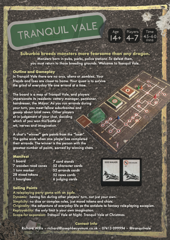
"Suburbia breeds monsters more fearsome than any dragon…"
Tranquil Vale is a board game set in the most boring town in the country. The aim of the game is to keep your spirits up, whilst completing dull chores around town like: shopping; visiting the dentist; or getting a haircut.
This post focusses on its graphics. For an overview of its game design click here.
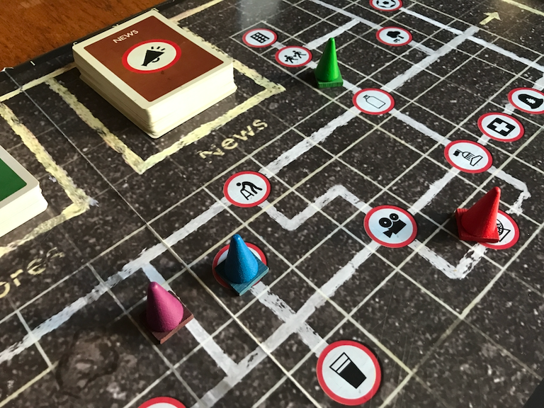
Like all British towns, the palette of Tranquil Vale is defined by that ubiquitous material: asphalt. Mottled dark grey predominates, an appropriate choice for a game with a mechanic built around sururban tedium. And where one finds asphalt, one also finds: painted lines; potholes; litter; and broken dreams.
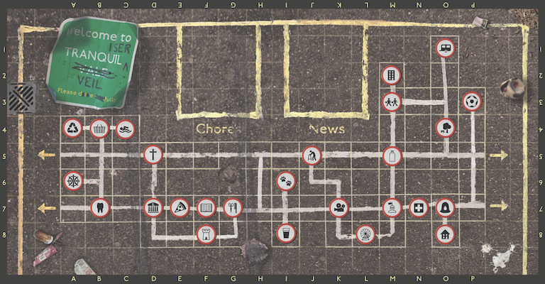
As on our actual roads, yellow lines create borders. White lines meanwhile denote the town's road map, connecting locations. A coherent style is achieved by having the rest of the graphics follow a road sign aesthetic. The various locations around town are denoted by red-bordered, round signs displaying simple black icons.
Details matter. The painted lines all differ slightly, and the squares containing the white lines are inconsistently sized, making the map feel more believable. And the round signs all have drop shadows so discreet you would not notice them without consciously looking. Without them though, they appear flat and lifeless.
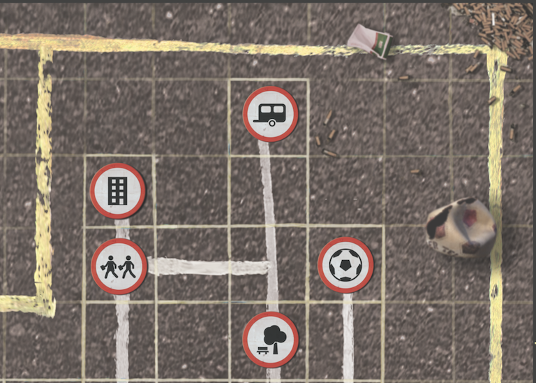
The litter is specifically chosen too: a punctured football; a pile of cigarette butts; a squashed hedgehog. These items speak of the 1970s; a grim period, and an association that helps set the mood.
These decisions are not only influenced by scene-setting and mood though. The asphalt is a subtle shade of brown, rather than grey. Yellow on brown, with bold red circles on white, are common accessibility colour contrasts. And map references along the edge of the board continue these accessibility considerations.
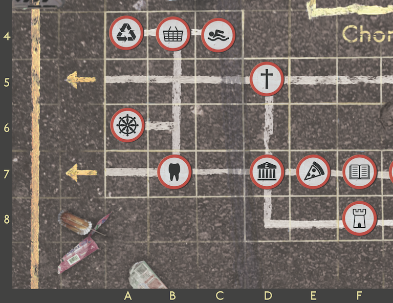
The shopping centre is at B4; useful to know if you are playing a character based there. Like the cleaner.
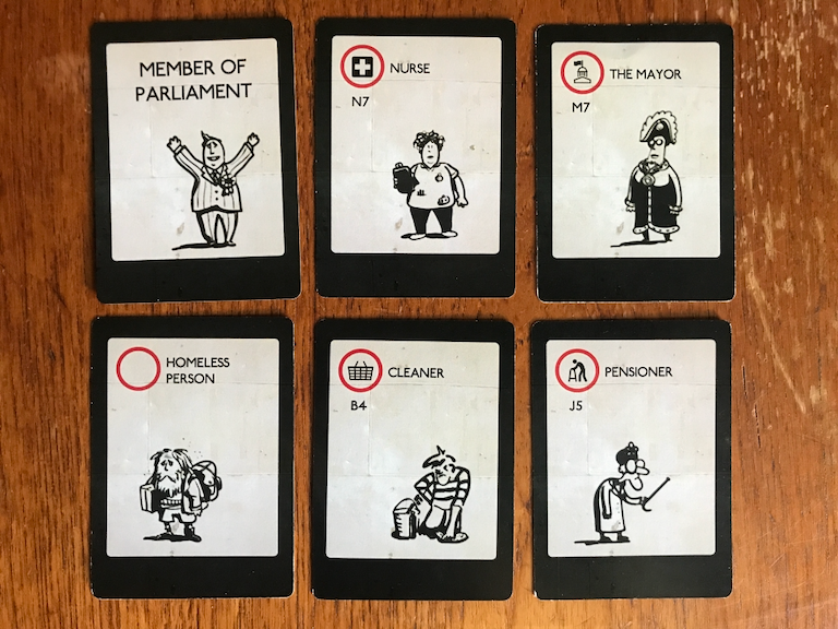
Character cards are two-sided: on the front, a icon and grid reference denoting that character's location on the board; and on the back, just the caricature and role, in a larger point size. The front is for that character's player, as she needs to know where her character is based; whilst the back is for the rest of the players, who only need to know who the character is, but be able to read it from further away.
Both sides of these cards are visible because of the coloured stands they slot into.
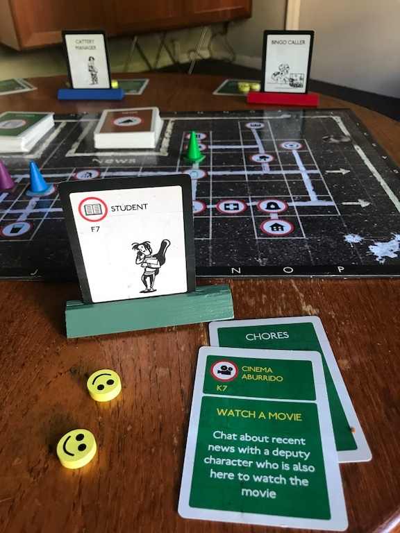
Here, the green player can see they are a student, based at the library at F7, whilst opposing them: a blue player playing a cattery manager; and a red player playing a bingo caller. And on the board: coloured traffic cones: appropriate playing pieces for the game's aesthetic. And in the foreground is a chores card. Our student is off to the cinema. Like the location signs on the board, and the character cards, these chores cards continue the road sign aesthetic (including the map references).
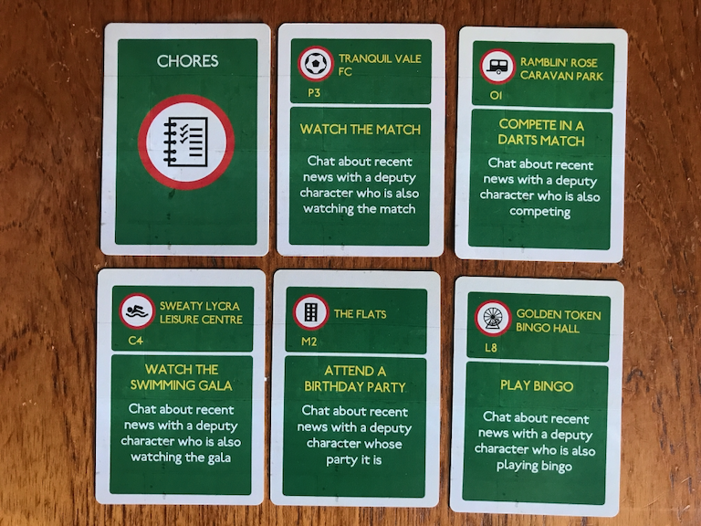
Chores are straightforward enough: go somewhere; and do something when you get there.
British road signs have a few distinct colour schemes: black on white; white on green; and for cultural signs, white on brown.
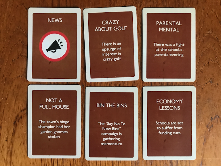
The game's mechanic is built around characters chatting about recent news. Each news card outlines a different, if resolutely provincial, news story (all of which, incidentally, are true stories from local papers across the UK).
The graphic design of Tranquil Vale works as a unified whole to set the mood for the gameplay. The greatest compliment one can give it is that it goes unnoticed by players. Like a good haircut - from the town's resident hairdressers Curl Up and Dye (square G7) - its quality is defined by its anonymity. It's strong and characterful, whilst merging quietly into the background.
The strong and consistent aesthetics made creating associated documents like this leaflet - that was was given out at the UK Games Expo in Birmingham - very straightforward.